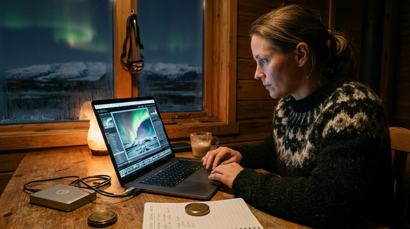
The ethereal dance of the Northern Lights across the Icelandic sky is a spectacle that captivates every soul fortunate enough to witness it. For photographers, it’s a dream come true – a chance to capture nature’s most magnificent light show. However, the journey from a raw, dark night sky image to a breathtaking, vibrant masterpiece isn't complete when you press the shutter. In fact, that's often just the beginning. The true magic, the vibrant greens, the subtle purples, and the dramatic interplay of light and shadow, often lies hidden within your camera's files, waiting to be unleashed through expert editing Northern Lights photos.
At Iceland Photo Map, we understand the thrill of chasing the aurora and the dedication required to secure that perfect shot. We also know that the challenging conditions of night photography in Iceland – low light, extreme cold, and the aurora’s dynamic nature – can leave your raw files with nuances that only skilled post-processing can resolve. This comprehensive guide is designed for the discerning photographer, the expert seeking to elevate their aurora borealis captures from mere records to compelling works of art. We’ll take you on a detailed journey from understanding your raw files to mastering advanced editing techniques, ensuring your Icelandic aurora memories glow with the intensity they deserve.
Understanding Your Raw Files: The Foundation of Northern Lights Photo Editing
Before diving into sliders and adjustments, it's crucial to understand the canvas you're working with: your camera's raw files. For aurora photography, shooting in RAW format isn't just a recommendation; it's an absolute necessity. Unlike JPEGs, which are compressed and processed in-camera, RAW files retain the maximum amount of image data captured by your sensor. This greater data retention provides significantly more flexibility during editing Northern Lights photos, allowing you to recover details, correct colors, and manage noise with far greater precision. Source: Adobe source.
RAW files from an aurora shoot often present specific characteristics. You’ll notice a wide dynamic range, encompassing the deep blacks of the night sky and the bright, luminous glow of the aurora. This extensive range is a blessing, as it holds detail in both the darkest shadows and brightest highlights. However, it also means your initial image might appear flat or underexposed, a common starting point for aurora photography to protect highlights. Color depth is another critical aspect; RAW files typically capture 12 or 14 bits of color information per channel, compared to JPEG's 8 bits. This translates to billions more colors, providing a smoother gradient and more accurate color reproduction, which is paramount when dealing with the aurora's subtle hues.
Inherent noise is almost often a factor in high-ISO aurora shots, a common challenge in night photography, as detailed by astrophotography guides such as those from Lonely Speck. While modern cameras excel in low light, pushing ISO sensitivities to 3200, 6400, or even higher will inevitably introduce both luminance (grainy texture) and color (speckles of incorrect color) noise. Your initial assessment of a raw aurora file should involve identifying these common issues: is there a strong color cast (often green from light pollution or magenta from incorrect white balance)? Is the overall image underexposed, making the aurora appear faint? Is the noise level distracting? Recognizing these challenges early informs your entire post-processing strategy.
The in-camera settings you used also profoundly impact your post-processing flexibility. A slightly underexposed image with a lower ISO often provides more latitude for recovery than an overexposed one, where highlight detail might be permanently clipped. A wider aperture (e.g., f/2.8 or f/4) allows more light in, reducing the need for excessively high ISOs, thus minimizing noise. Shutter speed, while dictating the aurora's movement capture, also influences overall brightness. Understanding these relationships is the first step in successful aurora borealis post processing.
Essential Post-Processing Tools for Aurora Borealis
The right software can make all the difference when transforming your raw aurora captures into stunning final images. While many powerful tools exist, some have become industry standards for their robust features and efficient workflows.
Adobe Lightroom Classic stands out as a preferred choice for many aurora photographers. Its non-destructive editing environment means your original raw files are often preserved, and all adjustments are recorded as metadata, a key feature highlighted in Adobe's own documentation on non-destructive editing. Lightroom Classic excels at cataloging, organizing, and batch processing, making it ideal for handling hundreds of images from an intense aurora chase. Its comprehensive Develop module offers a vast array of tools for global and local adjustments, color grading, and noise reduction. Lightroom CC (the cloud-based version) offers similar capabilities with the added benefit of seamless syncing across devices, though its organizational features are less robust than Classic for large, locally stored libraries. Source: Lonelyplanet source. Source: Helpx Adobe source. Source: Lonelyplanet source. Source: Space source.
For more intricate work, especially complex compositing, precise masking, or advanced pixel-level retouching, Adobe Photoshop remains the industry benchmark. While less suited for initial raw processing and cataloging, Photoshop is invaluable for tasks like blending multiple exposures (e.g., a short exposure for sharp foreground and a longer one for aurora), precise sky replacement, or intricate noise reduction techniques that go beyond Lightroom's capabilities. Many photographers use a hybrid workflow, starting in Lightroom for global adjustments and then sending specific images to Photoshop for refinement.
Capture One Pro is another professional-grade raw converter known for its superior color rendition, tethered shooting capabilities, and excellent detail preservation, particularly for certain camera systems. While it has a steeper learning curve than Lightroom, many professionals swear by its image quality and advanced masking tools.
Beyond the primary raw editors, specialized plugins and AI-powered tools have revolutionized noise reduction. Programs like Topaz Denoise AI and DxO PhotoLab (with its DeepPRIME noise reduction) leverage artificial intelligence to dramatically reduce noise while preserving fine detail. These tools are often highly regarded for their ability to enhance high-ISO aurora shots, offering capabilities that complement or extend beyond the built-in noise reduction features of Lightroom or Capture One.
To set up an efficient workspace, regardless of your chosen software, consider these tips: use a dual-monitor setup if possible, dedicating one screen to your image and the other to your editing panels. Calibrate your monitor regularly (more on this later) to ensure accurate color representation. Familiarize yourself with keyboard shortcuts to speed up your workflow. Consistency in file naming, keywording, and folder structures will save you countless hours in the long run.
Step-by-Step Lightroom Workflow for Editing Northern Lights Photos
This workflow focuses on Adobe Lightroom Classic, which provides a powerful and intuitive environment for editing Northern Lights photos. Each step builds upon the last, taking you from a raw file to a polished image.
Import and Organize
The first step is to bring your images into Lightroom and organize them effectively.
- Import: Connect your camera's memory card or external drive. In Lightroom, click "Import..." and navigate to your photos. Choose "Copy as DNG" or "Copy" (if you prefer to keep original RAW format) to transfer files to your hard drive. Avoid "Add," which leaves files on the card.
- Destination: Set up a logical folder structure, perhaps by year, then month, then specific shoot (e.g.,
2026/03_IcelandAurora/). - Keywords & Metadata: During import, apply keywords like "Iceland," "Northern Lights," "Aurora Borealis," "night photography," and specific locations (e.g., "Kirkjufell," "Jökulsárlón"). This makes finding images later much easier. You can also add your copyright information automatically.
- Initial Culling: Quickly flag or rate images (e.g., 1-5 stars) to identify keepers and discard obvious rejects. Don't spend too much time here; focus on broad selection.
Basic Global Adjustments
These foundational adjustments correct major issues and establish a strong base for further refinement. Navigate to the Develop module.
- White Balance (WB): This is often the most critical initial adjustment for aurora shots. Auto WB rarely gets it right in low light. Start by trying the "Custom" eyedropper tool on a neutral gray or white point in your image (if available). More often, you'll need to manually adjust the Temp (blue-yellow) and Tint (green-magenta) sliders. For aurora, a common starting point is around 3000-4500K for Temp, with a slight shift towards magenta on the Tint slider to counteract any green light pollution. Trust your eyes to make the sky look natural, not overly blue or green.
- Exposure: Your raw aurora files often appear underexposed to protect highlights. Gently increase the Exposure slider to bring out the overall brightness of the scene. Be careful not to blow out the aurora's brightest parts.
- Contrast: Add a touch of contrast to give the image more punch.
- Highlights: Pull down the Highlights slider to recover detail in the brightest parts of the aurora or any artificial light sources.
- Shadows: Lift the Shadows to reveal details in the foreground and darker areas of the sky without introducing excessive noise.
- Whites & Blacks: Adjust the Whites slider to set the brightest point in your image (just before clipping) and the Blacks slider to define the darkest point. This expands the dynamic range and adds depth.
Presence Panel
These sliders in the Basic panel help enhance texture, clarity, and color vibrancy.
- Clarity: A small increase in Clarity (e.g., +10 to +20) can add definition to the aurora's swirling structures and foreground elements. Too much will make the image look harsh and introduce halos.
- Dehaze: Occasionally, Dehaze can be used sparingly (e.g., +5 to +10) to add a subtle pop, but be cautious as it can easily create an unnatural, overly dark sky or introduce color shifts.
- Vibrance: This intelligently boosts less saturated colors more than already saturated ones. It’s excellent for enhancing the aurora's colors without making skin tones (if present) look artificial.
- Saturation: Use Saturation sparingly, if at all, after Vibrance. It boosts all colors equally and can quickly lead to an over-processed, unrealistic look.
Tone Curve
The Tone Curve offers precise control over contrast and luminosity.
- S-Curve: A gentle S-curve (lifting the highlights, darkening the shadows) is a classic way to add pleasing contrast. You can use the parametric curve (Lightroom's point curve) or the point curve for more fine-tuned adjustments.
- Channel-Specific Curves: For advanced color grading, you can adjust the Red, Green, and Blue channels independently to influence color shifts in highlights, midtones, and shadows. For instance, a slight lift in the blue channel in the shadows can cool down the dark sky.
For those looking to deepen their general photography skills, including understanding how camera settings influence post-processing, we offer a dedicated photography 'how-to' section on our site.
Advanced Techniques for Refining Your Aurora Images
Once the global adjustments are solid, it's time to dive into the more nuanced and selective techniques that truly make your aurora images shine.
Noise Reduction Strategies
Noise is an inevitable companion of high-ISO night photography. Lightroom offers built-in noise reduction, but knowing how and when to use it, and when to seek external help, is key. Luminance Noise Reduction: This targets the graininess in your image. Start by zooming in to 1:1 to accurately assess the noise, a crucial step for precise adjustments. Increase the Luminance slider gradually. Be wary of going too high, as it can soften details and give your image a "plastic" appearance. The Detail and Contrast sliders within the Luminance section can help fine-tune the effect, bringing back some lost texture. Color Noise Reduction: This can often be applied more aggressively than luminance noise reduction, effectively blending color values to eliminate colored speckles without significant loss of detail as it averages out color values. Lightroom's default setting (usually 25) is often a good starting point. Adjust the Color and Detail sliders as needed to eliminate colored speckles without desaturating important colors. External Software: For superior results, especially with very noisy files, consider dedicated noise reduction software like Topaz Denoise AI or DxO PhotoLab's DeepPRIME. These programs use advanced algorithms to differentiate between noise and genuine detail, offering remarkable improvements. The workflow typically involves exporting a high-quality TIFF or DNG from Lightroom, processing it in the external software, and then re-importing the denoised file back into Lightroom for further editing. This external step is crucial for maintaining maximum detail while achieving a clean look.
Color Grading with HSL/Color Mixer and Split Toning
This is where you fine-tune the aurora's vibrant colors and establish the overall mood of your image.
- HSL/Color Mixer: This panel (Hue, Saturation, Luminance) allows you to isolate and adjust specific color ranges.
- Hue: Shift the green hues of the aurora slightly towards yellow or teal to match your artistic vision. You might also adjust the blue hues of the sky.
- Saturation: Enhance the saturation of specific aurora colors (e.g., greens, purples, reds) without affecting other parts of the image. Be subtle; over-saturation is a common pitfall.
- Luminance: Adjust the brightness of specific colors. For example, you might slightly darken the blues in the sky to make the aurora pop more, or slightly brighten the aurora's green.
- Split Toning: This tool adds color casts to your highlights and shadows independently, creating a cohesive color palette. For aurora, you might add a subtle cool tone (e.g., blues or cyans) to the shadows to enhance the night feel, and perhaps a very slight warm tone (e.g., yellow or orange) to the highlights to complement the aurora's glow or any artificial light in the foreground.
Local Adjustments
Not every part of your image needs the same treatment. Local adjustments allow you to selectively enhance specific areas.
- Brushes: The Adjustment Brush is incredibly versatile. Use it to:
- Selectively brighten the aurora's core, increasing exposure, contrast, and clarity.
- Darken light-polluted areas of the sky.
- Add warmth or cool tones to specific elements.
- Sharpen foreground details.
- Radial Filters: These create an elliptical mask, useful for:
- Drawing attention to the aurora by slightly darkening and desaturating the edges of the frame.
- Creating a subtle vignette effect.
- Adding a glow to a central aurora display.
- Graduated Filters: Ideal for adjusting large, linear areas like the sky or horizon. Use them to:
- Darken the upper sky to add drama.
- Reduce light pollution near the horizon.
- Balance exposure between a bright foreground and a dark sky (though often better achieved with exposure blending).
Sharpening
Sharpening enhances edge definition, but it must be applied judiciously to avoid accentuating noise.
- Amount: Start with a moderate amount (e.g., 40-60).
- Radius: A smaller radius (e.g., 0.8-1.2) is generally better for fine details.
- Detail: Increase this to recover more fine detail, but be cautious as it can reintroduce noise.
- Masking: This is the most crucial slider for aurora sharpening. Hold down the Alt/Option key while dragging the Masking slider. White areas show where sharpening is applied, black areas where it's masked out. Drag it until sharpening is primarily applied to the aurora's structures and sharp foreground elements, not the smooth sky or noisy areas.
Common Pitfalls and How to Avoid Them in Aurora Post-Processing
Even with advanced tools, it's easy to fall into traps that detract from the natural beauty of the aurora. Being aware of these common pitfalls will help you maintain the integrity and realism of your images.
Over-editing: This is a very common mistake, and with the many tools available today, it's easier than ever to over-edit. The desire to make the aurora "pop" can lead to excessive adjustments. Signs of an over-processed image include blown-out highlights in the aurora, crushed shadows, unnatural colors, and a generally artificial appearance. Photographers often strive for a natural, believable look. Your goal is to enhance what was there, not create something entirely new. Periodically step away from your screen, then come back with fresh eyes. Compare your edited image to the original raw file to gauge the extent of your changes.
Excessive Noise Reduction: While noise is undesirable, overly aggressive noise reduction can be worse. It can lead to a loss of fine detail, making the aurora look soft, blurry, or "plastic." The stars might disappear, and the texture of clouds or foreground elements can be smeared. Photographers often zoom in to 1:1 when applying noise reduction to monitor the trade-off between noise reduction and detail preservation. Sometimes, a little bit of fine grain is preferable to a completely smooth, artificial-looking image. Tools like Topaz Denoise AI are designed to mitigate this, but even they have limits.
Unnatural Colors: The aurora's colors are vibrant, but they are also naturally occurring. Over-saturating the greens, pushing hues too far into unnatural blues or purples, or applying dramatic color shifts can make the aurora look artificial and even cartoonish. While artistic interpretation is valid, it should still feel grounded in reality. Use the HSL panel subtly, and rely more on Vibrance than Saturation for color boosts. Remember that the human eye perceives colors differently in low light, so striving for an exact match to what you "saw" might not often be the most aesthetically pleasing or realistic outcome.
Ignoring the Foreground: Many stunning aurora photos include a compelling foreground element, whether it's an Icelandic waterfall, a quaint church, or a dramatic mountain peak. Ignoring these elements in post-processing leaves the image unbalanced. Ensure the foreground is well-exposed, sufficiently sharp, and complements the aurora rather than competing with it. Use local adjustments to brighten shadows, enhance details, and correct color casts in the foreground. A strong foreground adds context and depth, making your aurora image more impactful. Consider exploring our Iceland Landscape Photo Maps to find locations with incredible foreground potential for your aurora shots.
Poor White Balance: An incorrect white balance can dramatically affect the overall realism of your image. A sky that is too warm (yellow/orange) or too cool (overly blue) will detract from the aurora's natural glow. Green or magenta color casts from light pollution are also common. Take the time to meticulously set your white balance, experimenting with the Temp and Tint sliders until the night sky looks neutral and the aurora's colors appear accurate and pleasing. This foundational adjustment impacts every subsequent color decision.
Not Calibrating Your Monitor: This is a critical yet often overlooked step. If your monitor isn't calibrated, the colors and brightness you see on screen might not accurately represent the actual image data. This means your perfectly edited aurora photo could look completely different on another screen or when printed. Invest in a monitor calibration device (like those from X-Rite or Datacolor) and calibrate your display regularly (e.g., once a month). This ensures consistent and accurate color representation, giving you confidence that your edits will translate faithfully across different viewing platforms, a practice essential for any serious photographer to ensure color accuracy.
Preserving the Magic: Exporting and Sharing Your Edited Aurora Photos
After hours of meticulous editing, the final step is to prepare your images for sharing and display. Exporting correctly ensures your hard work translates beautifully across various platforms, whether for web, print, or archiving.
Optimal Export Settings
The best export settings depend on the intended use of your image.
- File Format:
- JPEG: The most common format for web sharing, email, and general viewing. It's a compressed format, so choose a quality setting of 80-100 (or "High" to "Maximum") to minimize artifacting.
- TIFF: A lossless format ideal for sending to print labs or for further editing in other software (like Photoshop, if you started in Lightroom). TIFF files are much larger than JPEGs but preserve maximum image quality.
- DNG: If you processed your RAW files into DNG, you might export a new DNG with adjustments if you want to retain the non-destructive editing capabilities and smaller file size compared to TIFF.
- Resolution & Sizing:
- For Web/Social Media: Many platforms recommend a long edge around 1080px to 1200px, though specific requirements can vary. This keeps file sizes manageable for fast loading and avoids unnecessary detail that won't be visible. Set resolution to 72 PPI (pixels per inch).
- For Print: Consult your print lab for their specific requirements. Generally, 300 PPI is standard for high-quality prints. You'll want to export at the full resolution of your camera or the specific dimensions required for the print size.
- Output Sharpening: Lightroom offers "Output Sharpening" during export. This is a final, subtle sharpening pass optimized for the intended output (screen or paper). Select "Sharpen for Screen" or "Sharpen for Print" and choose the appropriate amount (Standard or High). This is different from the creative sharpening applied in the Develop module.
Understanding color spaces is crucial for consistent viewing. sRGB: This is the most widely used color space for web, social media, and most consumer-grade prints. It has a smaller color gamut (range of colors) but ensures your images look consistent across the majority of displays and browsers. It is generally recommended to export to sRGB for web and social media. Adobe RGB (1998): This color space has a wider gamut than sRGB, capable of displaying more saturated colors. It's often used for professional printing or by photographers who work in a fully color-managed workflow. If you're sending files to a professional print lab that specifically requests Adobe RGB, then use it; otherwise, stick to sRGB for broad compatibility. For a deeper dive into color management, resources like Adobe's official guides are invaluable.
Best Practices for Watermarking and Social Media
Protect your work and prepare it for public display.
- Watermarking: If you wish to protect your images from unauthorized use, apply a subtle watermark during export. Lightroom allows you to create custom watermarks (text or graphic) and position them. Keep it unobtrusive; a large, distracting watermark detracts from the image itself.
- Social Media Prep: Most social media platforms compress images, which can degrade quality. Exporting at recommended dimensions (e.g., 2048px on the long edge for Facebook, 1080px wide for Instagram) and using the sRGB color space can help minimize this degradation.
Archiving Your Raw and Edited Files
Your aurora photos are precious. Proper archiving ensures their longevity. Raw Files: It is highly recommended to back up your original raw files to at least two separate locations (e.g., an external hard drive and a cloud service). These are your negatives and contain the most data. Edited Files: Save your final, high-resolution edited images (e.g., as TIFFs or high-quality JPEGs) in a separate, organized folder. This saves you from re-editing from scratch if you need the image again. Lightroom Catalog: Regularly back up your Lightroom catalog, which contains all your edits and organizational data.
To capture more incredible moments worth preserving through these expert techniques, remember to discover prime aurora viewing locations across Iceland with our comprehensive maps.
Conclusion: Your Journey to Mastering the Aurora's Glow
The journey of capturing and editing Northern Lights photos from Iceland is one of passion, patience, and technical skill. From the initial thrill of seeing the aurora dance to the meticulous process of bringing out its true brilliance in post-processing, every step contributes to the final masterpiece. We've explored the critical importance of shooting in RAW, navigated the powerful features of tools like Lightroom, delved into advanced techniques for noise reduction and color grading, and highlighted common pitfalls to avoid.
Remember, post-processing is not about creating something that wasn't there; it's about revealing the hidden potential within your raw files, enhancing the beauty you witnessed, and translating that magical experience into a visual story. It's an art form in itself, requiring continuous practice, experimentation, and the development of your personal editing style. Don't be afraid to try new techniques, but often strive for a natural and compelling result that honors the aurora's splendor.
The unique and rewarding experience of photographing the aurora in Iceland is unparalleled. With these expert techniques, you're now equipped to transform your captures into breathtaking images that truly reflect the awe-inspiring glow of the Northern Lights. Keep shooting, keep learning, and keep sharing the magic.
Frequently Asked Questions
What's the best software for editing Northern Lights photos?
While several excellent options exist, Adobe Lightroom Classic is widely considered the best all-around software for editing Northern Lights photos. Its non-destructive workflow, powerful raw processing capabilities, and efficient cataloging system make it ideal for handling large volumes of night sky images. For advanced noise reduction, external plugins like Topaz Denoise AI or DxO PhotoLab DeepPRIME are highly recommended. For pixel-level work or complex compositing, Adobe Photoshop is the industry standard.
How can I effectively reduce noise in my aurora images without losing detail?
Effective noise reduction requires a balanced approach. Start with Lightroom's built-in Luminance and Color Noise Reduction sliders, adjusting them carefully while zoomed in to 1:1. Use the "Detail" and "Contrast" sliders within the noise reduction panel to fine-tune the effect and retain some texture. For superior results, especially with very noisy files, external AI-powered software like Topaz Denoise AI or DxO PhotoLab's DeepPRIME offers significantly better detail preservation. The key is to avoid over-processing, which can lead to a "plastic" or blurry look; a little bit of fine grain is often preferable to excessive smoothing.
Is it possible to recover detail from overexposed aurora shots?
Recovering detail from truly overexposed aurora shots is extremely difficult, and often impossible, especially if the highlights are "clipped" (meaning the camera sensor recorded maximum white with no detail). RAW files offer some latitude, allowing you to pull back slightly overexposed highlights using the "Highlights" slider in Lightroom. However, if the aurora's brightest parts appear as pure white without any texture or color, that information is likely lost forever. This is why many aurora photographers intentionally slightly underexpose their shots to protect the highlights, knowing they can recover shadow detail more easily in post-processing.
What are common mistakes to avoid when post-processing aurora borealis?
Several common pitfalls can detract from your aurora images. These include over-editing (making the image look artificial), excessive noise reduction (losing detail and creating a plastic look), unnatural or overly saturated colors, ignoring the foreground (leaving it too dark or unbalanced), and incorrect white balance (leading to unrealistic sky colors). Additionally, working on an uncalibrated monitor can lead to inaccurate color representation. The goal is to aim for a natural, believable enhancement of the scene you witnessed.
How do I make the green colors of the aurora pop without looking artificial?
To make the green colors of the aurora pop naturally, use a combination of techniques within your chosen software. Start with a precise white balance to ensure the sky is neutral. In Lightroom, use the "Vibrance" slider in the Basic panel to intelligently boost less saturated colors. Then, go to the HSL/Color Mixer panel. Select the "Green" hue and gently increase its saturation. You can also slightly adjust the "Hue" of green to shift it towards a more vibrant lime or teal, depending on your preference. Be subtle with all these adjustments. A slight increase in "Clarity" in the Basic panel can also add definition to the aurora's structures. The key is to make incremental adjustments and frequently compare your edited image to the original to ensure you're enhancing, not distorting, the natural beauty.
Explore our Iceland Photo Maps to discover the best locations for capturing your own stunning Northern Lights photos, ready for your expert editing touch!