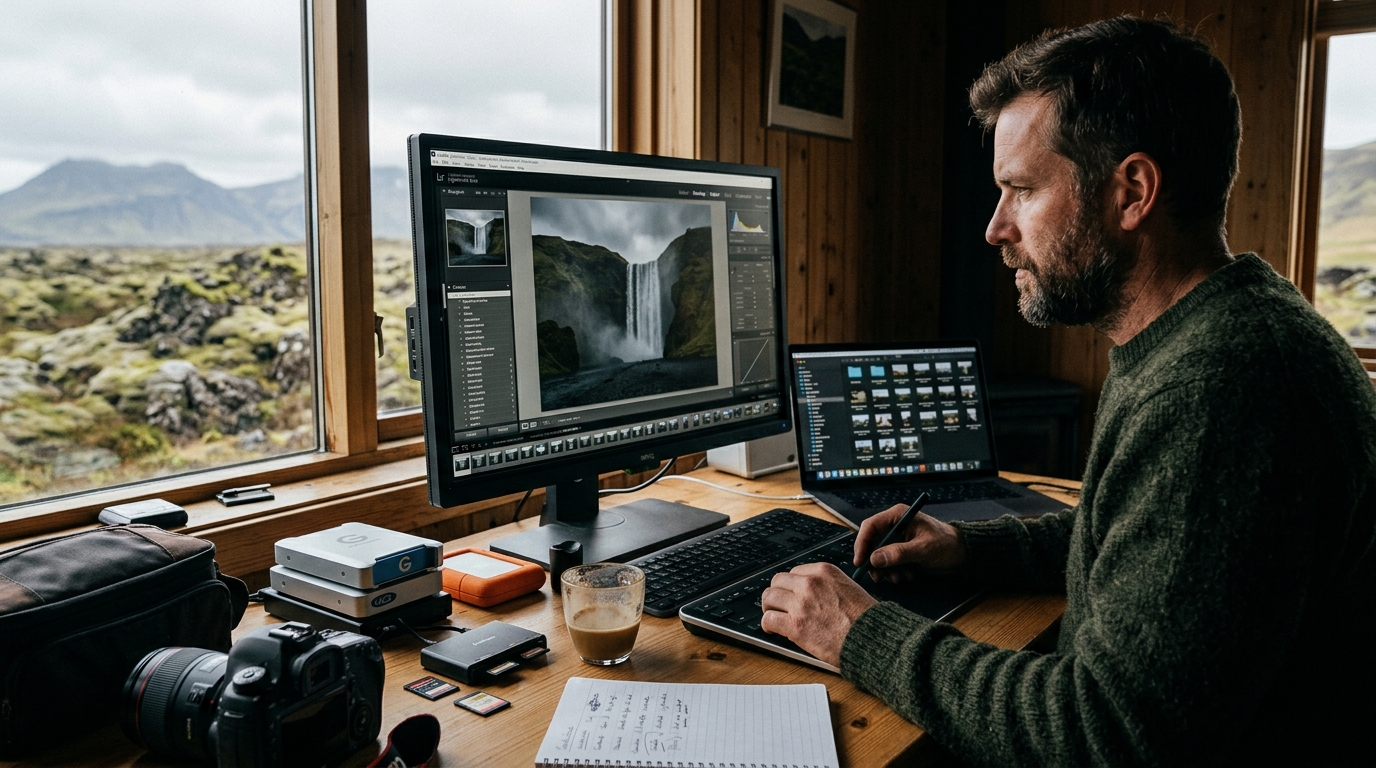
Mastering a professional Iceland photography post-processing workflow is the final bridge between capturing the raw, ethereal beauty of the North and producing gallery-quality imagery. Because Icelandic light behaves differently than anywhere else on Earth—often characterized by extreme contrast, rapid weather shifts, and unique spectral qualities—standard editing presets frequently fail to capture the nuance of the landscape.
By implementing a structured approach to your digital darkroom, you can ensure that the deep basalt textures, vibrant mossy greens, and crystalline glacial whites retain their integrity from capture to final output. Whether you are processing images of Dettifoss or the delicate architecture of a rural chapel, this guide outlines the professional techniques necessary to elevate your portfolio.
The Foundation: Preparing Your Iceland Photography Post-Processing Workflow
The success of your edit begins long before you open software. Shooting in RAW is essential for Icelandic landscapes; the high-contrast scenes—where bright, reflective glacial ice meets near-black volcanic sand—benefit from the full data depth of RAW files to avoid clipping highlights or crushing shadows. RAW files provide the necessary latitude to recover highlight and shadow detail that would otherwise be lost in compressed formats, as discussed in professional digital imaging documentation regarding RAW file processing standards. Source: Helpx Adobe source. Source: Adobe source. Source: Helpx Adobe source. Source: Color source.
Organization is equally critical. When returning from a trip, we recommend adopting a file structure that mirrors the Iceland Photo Map atlas structure. By organizing your files by region, date, and site—such as separating your files from the South Coast from those in the North—you maintain metadata integrity, which is essential for geotagging and future location research. Consistency in your color space is the final foundational step. For web display, sRGB remains the standard to ensure colors appear consistent across various browsers. However, for professional printing, Adobe RGB (1998) or ProPhoto RGB are often preferred by color management experts to provide a wider color gamut, as discussed in International Color Consortium (ICC) documentation. Further guidance on color management for digital displays can be found via the W3C sRGB specification.
Handling Extreme Dynamic Range in Icelandic Landscapes
Icelandic photography is defined by its dynamic range. You are frequently balancing the blinding white of a glacier against the deep, light-absorbing properties of basaltic rock. To manage this, luminosity masks are a highly effective tool. These masks allow you to target specific brightness levels, enabling you to darken highlights—such as the spray of a waterfall—without affecting the mid-tones or shadows of the surrounding cliffs.
When deciding between HDR merging and manual exposure blending, consider the movement in your frame. HDR software can sometimes introduce ghosting artifacts when dealing with flowing water or moving clouds. Manual exposure blending, performed in Photoshop using layer masks and brush opacity control, offers greater precision for complex scenes. For high-contrast static scenes, such as rock formations at Dritvik, HDR merging is often efficient and effective.
Advanced Iceland Color Grading Tips for Dramatic Results
The "Arctic blue" cast is a common hurdle for photographers working in overcast conditions. While this blue tint is often a natural part of the landscape’s atmosphere, it can make images feel sterile. To neutralize this without losing the mood, avoid simply cranking the temperature slider. Instead, utilize the HSL (Hue, Saturation, Luminance) panel to selectively desaturate the blue channel in the shadows while keeping the highlights slightly cooler. This retains the "icy" feel without the distracting color cast.
Enhancing mossy lava fields requires a delicate touch. The temptation is to increase saturation, but this often leads to neon-green artifacts that look unnatural. Focus instead on the luminance and hue sliders. By shifting the green hue slightly toward yellow, you mimic the organic look of the tundra. Furthermore, for moody coastal shots, try a "split toning" technique: introduce a subtle warm tone into the highlights and a cool, desaturated blue into the shadows. This adds depth and a cinematic quality that draws the eye toward the subject.
Refining Your Iceland Photography Post-Processing Workflow for Specific Sites
Every location requires a tailored approach. When editing images of high-contrast waterfalls, such as those found in our waterfall category, the primary challenge is maintaining texture in the water while keeping the surrounding rock detail. A common mistake is over-exposing the water to achieve a "bright" look. Instead, use a localized adjustment brush to slightly lower the exposure and increase the whites, which preserves the definition of the water flow.
Church architecture, such as the iconic black church at Búðakirkja, presents a different set of challenges. These structures are often set against complex, shifting light. Use your location-specific data from our interactive maps to understand the sun’s position during your shoot; this helps you decide how to adjust your global white balance. If the church is backlit, you may need to use a radial gradient to subtly lift the exposure of the building while cooling the temperature of the sky to prevent the white paint from appearing muddy.
Sharpening and Noise Reduction for High-Detail Landscapes
High-detail landscapes, particularly those featuring ice or complex basalt columns, demand careful sharpening. The goal is to enhance the appearance of texture without introducing "halos" or jagged edges. We recommend using the "Masking" slider in the Lightroom Detail panel (holding the Alt/Option key while sliding) to ensure that sharpening is only applied to the edges, not the smooth surfaces of the sky or water.
For night photography—common during the winter months in Iceland—noise reduction is critical. Long exposures can introduce digital noise in the shadows. Utilize AI-based noise reduction tools to clean up the image before applying sharpening. It is generally recommended to perform noise reduction early in your workflow, as sharpening can emphasize existing digital noise if applied before the image is cleaned.
Preparing Your Files for Professional Printing
If you intend to print your work, your workflow must change. Soft-proofing is essential. By using an ICC profile specific to your printing paper and laboratory, you can see how your colors will shift when moving from a backlit monitor to reflective media. Often, you will find that deep blues and saturated greens fall out of the printable gamut, requiring manual adjustment to keep the image looking "vibrant" on paper.
When resizing for large-format display, avoid massive jumps in resolution. Sharpening for print is also different from sharpening for the web; prints generally require more aggressive output sharpening because the ink tends to soften the fine details. Export your files as 16-bit TIFFs to retain the maximum amount of color data, and avoid JPEGs until the final stage of the process to prevent compression artifacts.
Common Post-Processing Mistakes to Avoid
The most frequent error in Iceland landscape photography is over-processing. A common "beginner" trap is applying heavy "Dehaze" or "Clarity" across the entire image. This creates halos around mountain peaks and makes the sky look artificial. Use these tools with restraint and apply them through a mask to maintain natural transitions. Ignoring the natural temperature of the light is another pitfall; if you shoot during the "Golden Hour," don't neutralize the warmth out of the image. That warmth is part of the story.
Finally, avoid over-sharpening. If you notice "white fringing" around dark edges, you have likely pushed your sharpening settings too far. When in doubt, apply less sharpening than you think you need. A sharp image should look natural, not crunchy or digital.
Frequently Asked Questions
What is the best color space for printing Iceland landscape photos?
For professional printing, Adobe RGB (1998) is widely considered an industry standard. It offers a larger color gamut than sRGB, which is useful for capturing the wide range of deep greens found in Icelandic moss and the intense blues of glacial ice. If your print lab supports it, ProPhoto RGB is even larger, though it requires careful management during the final export to avoid color shifts.
How do I fix the blue tint in my Iceland glacier photos?
The blue tint is often a result of the high Kelvin temperature of the ambient light. To fix this, use the HSL panel to adjust the saturation and luminance of the blue channel specifically, rather than just changing the global white balance. This allows you to keep the "cool" feel of the glacier while removing the distracting blue cast from the rocks or sky.
Should I use Lightroom or Photoshop for my Iceland workflow?
For a professional workflow, using both is common. Lightroom is excellent for initial organization, culling, and global adjustments. However, Photoshop is often preferred for the complex, layer-based work required for high-end landscape photography, such as luminosity masking, manual exposure blending, and precise object removal.
How do I manage large volumes of photos from a multi-day Iceland trip?
Effective management starts with a robust naming convention and a folder structure organized by location and date. Use the Iceland Photo Map guide to help categorize your images as you import them. By using smart collections in Lightroom to group your "best of" shots from each site, you can keep your workflow focused on the images with the highest potential for final output.
Ready to put your new editing skills to the test? Explore our interactive maps to find your next perfect shot in Iceland. Whether you are chasing the next waterfall or planning a trek to a remote lighthouse, our resources are designed to help you capture the best of the island's landscape.