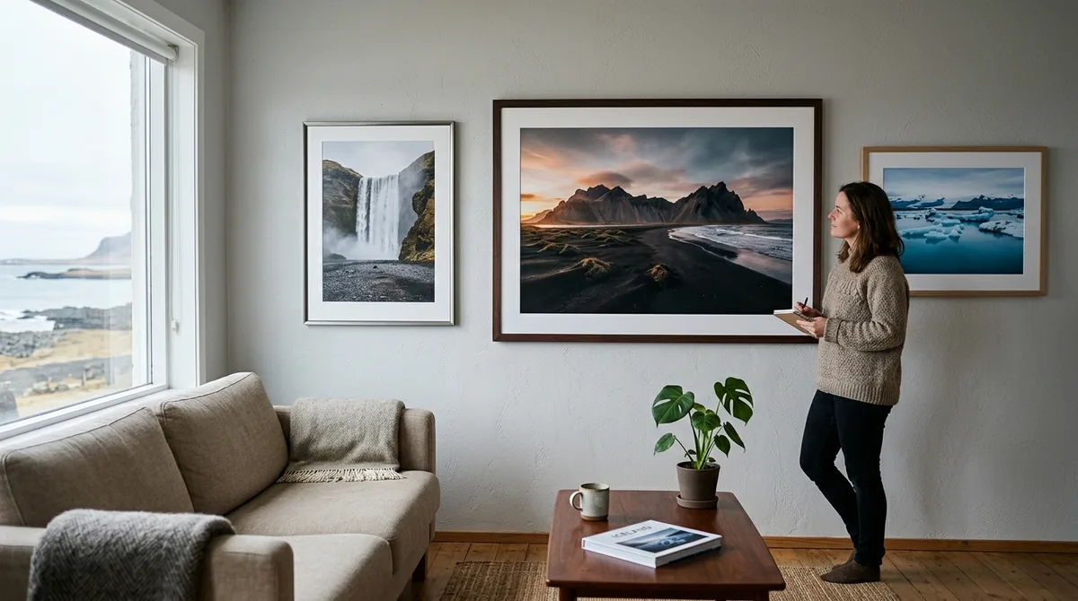
Choosing the right substrate and framing method is the single most critical factor in translating the stark, high-contrast dynamic range of Icelandic landscapes from a backlit sensor onto a physical wall. Implementing intentional Iceland photography print display ideas requires pairing the unique optical qualities of your subject—whether deep basalt shadows, crystalline glacial ice, or vibrant auroral ribbons—with the correct paper texture, dynamic range (Dmax), and archival glazing.
Every photographer who has stood before the jagged peaks of Vestrahorn or watched the midday glow slice through the icebergs of Jökulsárlón knows that Nordic light possesses a unique spectral quality. Yet, translating these raw files into physical art often results in disappointment: black sands print as muddy, featureless voids; electric green auroras clip into dull olive tones; and delicate highland fog gets lost under reflective glass. This comprehensive guide covers the technical and aesthetic decisions required to produce exhibition-quality physical prints of your Iceland portfolio.
The Print Decision Matrix: Matching Icelandic Light to Fine-Art Mediums
Physical prints do not emit light; they reflect it. Digital camera sensors capture up to 14 or 15 stops of dynamic range, and calibrated monitors display these scenes with strong backlighting. When you send a file to a fine-art pigment printer (such as an 11-color or 12-color Epson UltraChrome PRO or Canon LUCIA PRO ink set), you compress that broad dynamic range into the reflective capability of ink on paper or metal.
To preserve the emotional impact of Icelandic landscapes, you must match the physical characteristics of the substrate to the dominant tonal characteristics of the scene:
- Basalt, Volcanic Ash, and Highland Deserts (High Texture, Low Sheen): Heavyweight many cotton rag smooth or textured matte papers eliminate unwanted surface reflections, allowing subtle gradation in dark volcanic rock to show through without gloss differential.
- Glaciers, Ice Caves, and Diamond Beach (High Dynamic Range, Specular Highlights): High-Dmax baryta paper or direct acrylic face mounting emphasizes the clean highlights of translucent ice against dark sand.
- Aurora Borealis and Midnight Sun (Saturated Gamut, Deep Blacks): Acrylic face mounts and metallic/glossy baryta papers offer the widest color gamut and deepest black density (Dmax exceeding 2.4), rendering luminous night skies without flattening color.
- Braided Rivers and Geothermal Moss (Complex Color Gradients, Fine Detail): Smooth cotton rag or fine-texture baryta maintains tonal separation between neon-green mosses (Racomitrium lanuginosum) and silt-laden glacial runoffs.
| Substrate Type | Dmax Range | Surface Texture | Glare & Reflection | Optimal Iceland Subject |
|---|---|---|---|---|
| 100% Cotton Rag (Matte) | 1.6 – 1.9 | Smooth to moderate velvet tooth | Zero glare; fully diffuse reflection | Highland fog, volcanic craters, mossy lava fields, black sand textures |
| Baryta / Fibre-Based (Semi-Gloss) | 2.3 – 2.6 | Traditional darkroom satin/lustre | Low to moderate directional sheen | Glacial ice chunks, waterfalls, high-contrast coastal cliffs |
| Acrylic Face Mount (Optix-P99/TruLife) | 2.4 – 2.7 | Glass-smooth, optical clarity | Moderate to none (with anti-reflective acrylic) | Vivid Aurora Borealis, crystal-clear ice caves, high-saturation sunsets |
| Brushed Aluminum Dibond | 1.8 – 2.2 | Visible horizontal metal sheen | Moderate metallic iridescence | Industrial architecture, minimalist shipwrecks, monochrome seascapes |
Dynamic range compression becomes pronounced when moving from wide working color spaces (such as ProPhoto RGB or Adobe RGB 1998) to the gamut of physical pigment inks. Understanding this transition enables you to apply targeted tone mapping before sending files to the lab, ensuring your shadow details do not drop below the paper's minimum black threshold.
Fine-Art Papers Compared: Best Photo Paper for Landscape Prints of Nordic Terrain
Selecting the best photo paper for landscape prints requires balancing three variables: base material, surface coating, and the presence of Optical Brightening Agents (OBAs). The interaction between paper base tone and pigment ink sets determines how authentic your Icelandic scenes appear under room light.
When selecting physical media for landscapes captured with precise GPS field mapping, consider how the tonal range of specific regions behaves on different paper stocks.
100% Cotton Rag: Capturing Volcanic Mass and Atmospheric Highland Mist
Cotton rag papers—constructed from pure cotton linters rather than wood pulp—feature a matte surface devoid of chemical gloss coats. For scenes shot in overcast light across Landmannalaugar or the moss-draped canyons of the south coast, cotton rag is exceptional.
- For museum-grade conservation, choose natural white, OBA-free papers (such as Canson Edition Etching Rag) to help ensure long-term archival stability and resistance to aging. It exhibits a subtle surface tooth that imparts tactile volume to volcanic rocks and misty mountain layers. Its Dmax tops out around 1.82, producing charcoal-rich blacks without harsh specular reflections.
- Canson Infinity Rag Photographique (310 gsm): An ultra-smooth, pure white cotton paper with zero optical brighteners. It provides precise micro-contrast for fine geological formations, basalt columns, and distant braided river systems.
The primary benefit of matte cotton rag is the total absence of surface glare. It allows viewers to examine wide-angle Nordic vistas from any viewing angle without light fixtures obscuring corner details.
Baryta Papers: Dynamic Range for Ice Caves and Aurora Borealis
Baryta papers feature a barium sulfate coating applied to a traditional fibre base, replicating the look and feel of classic darkroom silver-gelatin prints. This layer prevents ink from penetrating too deeply into the raw paper fibres, producing high sharpness, saturated color gamuts, and exceptional Dmax.
- Hahnemühle FineArt Baryta (325 gsm): Known for high dynamic range and glossy finish. It renders the deep crystalline blues of Vatnajökull's subglacial vaults and the neon greens of the Aurora Borealis with luminous intensity.
- Canson Infinity Baryta Prestige II (340 gsm): Formulated with a barium sulfate layer and alpha-cellulose/cotton base, this paper offers a refined satin finish with minimal bronzing on heavy dark ink loads, making it suitable for high-contrast Diamond Beach shots.
Optical Brighteners (OBAs) vs. Natural White Bases
Many commercial photo papers use chemical Optical Brightening Agents (OBAs) that absorb invisible ultraviolet radiation and re-emit it in the blue spectrum, making the paper base appear brilliant white. However, OBAs degrade over time under UV exposure, gradually shifting the base color back toward yellow. Independent research by Wilhelm Imaging Research on print permanence demonstrates that OBA-free papers maintain spectral stability significantly longer than chemically brightened alternatives. For museum-grade conservation, choose natural white, OBA-free papers (such as Canson Edition Etching Rag) to help ensure long-term archival stability and resistance to aging.
Large Format Printing for Iceland Photos: Resolution, Viewing Distance, and Cropping
Implementing gallery-scale large format printing for iceland photos requires understanding the relationship between native sensor pixels, output physical dimensions, and human visual acuity. A sweeping panorama of the Fjallabak Nature Reserve displayed at 30x60 inches demands careful file preparation to maintain edge-to-edge micro-contrast.
Calculating Native PPI and Megapixel Requirements
Print labs standardize around two native input resolutions: 300 PPI (pixels per inch) for Canon and HP raster image processors (RIPs), and 360 PPI for Epson MicroPiezo printheads. To determine whether your sensor provides sufficient resolution for large-format outputs without interpolation:
Required Native Pixels = Target Width (Inches) × Target PPI
Example (24 × 36 inches @ 300 PPI):
Width:  36 in × 300 PPI = 10,800 pixels
Height: 24 in × 300 PPI =  7,200 pixels
Total Resolution Needed: 10,800 × 7,200 = 77.7 Megapixels
If you capture with a 45MP or 61MP full-frame sensor, a 24x36-inch print yields an un-interpolated resolution of approximately 230 to 260 PPI. Because large prints are viewed from greater distances (typically 3 to 5 feet), an input resolution of 200 to 240 PPI is visually indistinguishable from 300 PPI to the human eye.
AI Upscaling vs. Native Optical Sharpness
When producing prints exceeding 40x60 inches from lower-resolution files, machine-learning upscaling tools (such as Adobe Lightroom Super Resolution or Topaz Gigapixel AI) can reconstruct structural lines. However, be cautious with fine, chaotic textures common in Iceland:
- Lichen and Basalt Textures: Neural models may mistake chaotic volcanic texture for digital noise, smoothing it out or introducing unnatural geometric artifacts.
- Waterfall Spray and River Rapids: AI algorithms can over-sharpen fluid mist into brittle, plastic-looking patterns.
Inspect files at many and many magnification after applying AI scaling, selectively masking out sensitive organic textures if artifacts appear.
Three-Stage Sharpening Workflow for Large Prints
rarely send a master landscape file to a large-format printer with only general global capture sharpening applied. Implement a dedicated three-stage workflow:
- Capture Sharpening: Neutralizes softness caused by the camera's optical low-pass filter and lens diffraction (applied during initial RAW development).
- Creative Sharpening: Selectively applied via layer masks to draw focus to key elements—such as the wet edges of an iceberg or the ridges of a mountain crest.
- Output Sharpening: Tailored to the specific output size, viewing distance, and substrate. Matte fine-art papers absorb more ink ("dot gain") and require aggressive output sharpening, whereas baryta and glossy media require subtle edge enhancement to prevent haloing around high-contrast horizons.
Curating Your Space: Modern Iceland Photography Print Display Ideas
Selecting the right physical medium is only half the process; you must also consider spatial architecture, room proportions, and narrative sequence. Below are several creative Iceland photography print display ideas that complement contemporary interiors while honoring the raw scale of the North.
1. The Panoramic Multi-Panel Triptych
Vistas of locations like the rhyolite ridges of Landmannalaugar or the sheer headlands of Vestrahorn often benefit from wide panoramic ratios (such as 2:1 or 3:1). Rather than framing a single monolithic frame, split the composition across three vertical panels (a triptych) with a 1.5- to 2-inch gap between each panel.
This layout adds architectural rhythm to long living room walls, breaks up potential glare zones, and echoes the expansive horizontal scale of the sub-Arctic landscape.
2. Floating Acrylic Face Mounts vs. Deep-Set Shadow Boxes
For modern, Scandinavian-inspired interior spaces, frame choices should balance minimalism with visual depth:
- Floating Acrylic Face Mounts: The print is optically mounted behind 1/8-inch or 1/4-inch anti-reflective acrylic with an aluminum sub-frame recessed behind the print. The artwork appears to float 1 inch away from the wall, creating a clean presentation that suits high-key glacial photography and minimalist coastal scenes.
- Deep-Set Shadow Box Frames: Mount a heavyweight cotton rag print on a raised acid-free museum board, set back 1 to 1.5 inches from the glass within an untreated natural white oak or matte black frame. The subtle interior cast shadow emphasizes the three-dimensional texture of volcanic rock.
3. The Storytelling Narrative Grid
Iceland's landscape is defined by contrast: grand scale juxtaposed against intimate geological detail. A narrative grid pairs wide panoramic scenes with close-up abstract textures:
- Centerpiece: A 24x36-inch anchor print showcasing a wide volcanic expanse or glacial lagoon.
- Flanking Elements: Four 12x12-inch or 11x14-inch prints framing close-up basalt columns, geothermal mineral crusts, glacial ice crystals, and windblown black sand ripples.
This approach transforms a simple print display into a cohesive visual study of Icelandic geology.
Museum-Grade Framing and Glazing: Preserving Volcanic and Glacial Tones
Archival framing protects your investment from UV degradation, airborne pollutants, and mechanical warping caused by changing indoor environments. Using improper backing materials or low-grade glass can cause permanent discoloration and severe reflection issues.
According to the Library of Congress Preservation Guidelines for Matting and Framing, preservation framing calls for matboard made from 100% cotton rag or chemically purified, lignin-free wood pulp stock alongside reversible hinging methods. Never allow a fine-art print to sit in direct contact with glazing, as condensation can adhere the delicate ink emulsion to the glass surface over time.
Glazing Comparison: Optical Clarity and Preservation
Standard clear float glass reflects approximately many to many incident light, acting as a mirror in brightly lit rooms and washing out delicate shadow gradations. Professional framing calls for high-performance glazing options:
- Tru Vue Museum Glass: Premium 2.5mm glass featuring a magnetron-sputtered anti-reflective coating that reduces reflections to less than many while blocking up to many damaging UV rays (300–380 nm). It provides crystal-clear rendering of deep black sands without distracting room reflections.
- Optium Museum Acrylic: An anti-static, scratch-resistant, anti-reflective 3.0mm or 4.5mm acrylic substrate providing up to many UV rejection. It is shatterproof and significantly lighter than glass, making it the industry standard for prints measuring 30x40 inches and above.
- Standard Non-Glare Glass (Etched): Avoid acid-etched non-glare glass for fine-art landscape prints. Etched glass scatters light across its surface, creating a hazy blur that softens fine basalt textures and glacial edges.
Frame Profiles and Wood Finishes
Frame profiles should complement, rather than compete with, Nordic color palettes:
- Natural White Oak & Ash: Light, raw wood tones pair naturally with the soft greens, ochres, and cool blues of Icelandic highland and river landscapes.
- Matte Black Anodized Aluminum: Clean, thin-profile (1/4-inch to 3/8-inch face) metal mouldings provide an unobtrusive border that grounds high-contrast monochrome and volcanic imagery.
- Floating Gallery Frames: Used for canvas or wood-panel-mounted prints, maintaining an intentional 1/4-inch reveal gap between the print edge and the inner frame perimeter.
Lighting and Environmental Considerations for Iceland Photography Print Display Ideas
How an Iceland print appears in your home depends entirely on the spectral quality and angle of the illumination hitting the substrate. Displaying fine art under low-quality residential lighting can distort the delicate cool and warm tones captured in the field.
Color Rendering Index (CRI) and Color Temperature (CCT)
Standard household LED bulbs often feature a low Color Rendering Index (CRI under 80) with significant spectral gaps in the cyan, deep red, and blue wavelengths. Under low-CRI light, the electric blues of glacial ice shift toward muddy gray-green, and subtle rust-colored volcanic tephras lose their saturation.
- CRI Standard: Select LED gallery fixtures with a CRI rating of 95 or higher (with an R9 red value exceeding 90).
- Color Temperature: Choose lighting calibrated between 3000K (warm-neutral) and 4000K (clean gallery daylight). 3500K is ideal for Icelandic landscapes, providing enough warmth to render midnight sun highlights while keeping glacier blues crisp and pure.
Mitigating Reflections and Surface Glare
Position directional ceiling spotlights (such as narrow-beam track fixtures) at a 30- to 35-degree angle relative to the print surface. This angle directs specular surface bounce down toward the floor rather than directly back into the viewer's eyes, maximizing the perceived black depth (Dmax) of baryta and acrylic media.
Humidity and Thermal Control
Large-format cotton rag and fibre-based papers absorb moisture from ambient air. Research from the Image Permanence Institute indicates that fluctuating relative humidity accelerates mechanical stress and chemical deterioration in paper substrates. Displaying unsealed prints in environments with rapid humidity shifts (such as near HVAC vents, exterior doors, or radiators) can cause the substrate to ripple or buckle ("cockling"). Ensure your framing workshop secures the print using flexible archival corner pockets or Japanese paper T-hinges with wheat starch paste, allowing the paper to expand and contract naturally within the mat window.
Soft-Proofing and Print Lab Workflow: Avoiding Common Digital-to-Physical Pitfalls
The most frequent disappointment in landscape printing is an output that looks noticeably darker and flatter than the on-screen image. Digital monitors emit light, creating an artificial sense of luminance that reflective paper cannot duplicate without careful file preparation.
Step 1: Calibrate Monitor Luminance
Most computer displays ship from the factory calibrated for office or gaming environments with extreme brightness levels (250 to 350 cd/m²). For accurate soft-proofing of fine-art prints, use a hardware colorimeter (such as a Calibrite Display Plus HL or Datacolor Spyder X2) to calibrate your monitor to the following standards:
- Luminance / Brightness: 80 to 120 cd/m² (100 cd/m² is standard for typical home display environments).
- White Point: D65 (6500K) for general digital editing, or D50 (5000K) if soft-proofing under specialized 5000K viewing booths.
- Gamma: 2.2.
Step 2: Install Custom Lab ICC Profiles
Professional print labs provide custom ICC profile packages conforming to standards established by the International Color Consortium for each specific printer-and-paper combination they run. Download these profiles and install them into your operating system's color management directory.
In Adobe Photoshop or Lightroom Classic, activate the soft-proofing module:
- Select your target paper's profile (e.g., "Epson_P20000_Hahnemuehle_PhotoRag308.icc").
- Set the Rendering Intent to Relative Colorimetric with Black Point Compensation enabled. Relative Colorimetric maps out-of-gamut colors to the nearest reproducible shade while maintaining the relationship between in-gamut tones. Use Perceptual intent if your composition contains broad gradients of high-saturation auroras or sunset clouds that show banding under Relative Colorimetric.
- Enable Simulate Paper & Ink. The on-screen image will immediately look lower in contrast; this reflects true paper Dmax limitations. Use adjustment curves and targeted HSL adjustments to recover shadow separation and midtone contrast while soft-proof preview remains active.
Step 3: Order Lab Proof Strips
Before investing in an expensive 30x45-inch or 40x60-inch print, order a many scale proof strip (typically an 8x36-inch or 10x30-inch slice through the most critical highlight and shadow areas of your frame). Inspect this physical test strip under your home's target lighting setup to verify edge sharpness, micro-contrast in dark basalt sands, and color fidelity.
For independent comparisons of field planning tools and maps that help locate these photogenic environments, consult the site's detailed guide comparison to review workflow solutions on their own merits.
From Field Coordinates to Living Room Showcase
Producing gallery-worthy fine art requires precision at every stage: from researching compositions and planning for sub-Arctic light to processing raw files and executing archival mounting. A successful physical print reflects intentional craft across every step of this workflow.
Pre-Lab Output Checklist
- Aspect Ratio Verified: Master crop fits the target paper proportions without unintended edge clipping.
- Sensor Dust Cleaned: A many zoom scan conducted across open skies and uniform glacial snowfields to remove all sensor spots.
- Gamut Clipping Corrected: Soft-proofing checked with the lab's ICC profile for out-of-gamut blues and greens.
- Luminance Compensated: Shadow tones raised to account for paper Dmax limits at a calibrated 100 cd/m² display brightness.
- Output Sharpening Applied: Radius and amount tuned specifically to the final substrate (matte vs. baryta/acrylic).
- Color Space Assigned: File exported in Adobe RGB (1998) or 16-bit ProPhoto RGB, as specified by your print lab's intake instructions.
Frequently Asked Questions
What is the best photo paper for landscape prints featuring bright ice and dark volcanic sand?
The best substrate for scenes combining bright glacial ice and deep volcanic sand is a heavy, semi-gloss Baryta paper (such as Canson Infinity Baryta Prestige II or Hahnemühle FineArt Baryta 325). Baryta provides a high maximum optical density (Dmax 2.4+) to render deep black sands without muddying, while preserving specular highlight separation and crisp blue tones within glacial ice.
How high of a camera resolution do I need for large format printing for Iceland photos?
For prints up to 24x36 inches, a 36 to 45-megapixel sensor provides enough native resolution to print between 200 and 300 PPI without digital upscaling. For larger outputs (such as 40x60 inches or multi-panel panoramic triptychs), files from 24MP to 45MP cameras can be enlarged using AI-assisted interpolation tools, provided the original image was shot with sharp optical technique at base ISO.
Should I choose acrylic face mounting or framed cotton rag for displaying aurora borealis images?
Acrylic face mounting is typically the superior choice for Aurora Borealis imagery. The optical clarity of the acrylic layer combined with a high-gloss metallic or baryta base boosts perceived dynamic range and black depth, making vibrant green and violet auroral bands appear luminous. Framed cotton rag is better suited for muted volcanic scenes, highland mist, and textured landscapes where glare-free viewing is preferred.
How do I prevent my Iceland waterfall and glacier prints from looking too dark once printed?
Prints look too dark primarily because uncalibrated computer monitors are set to excessive brightness levels (200–350 cd/m²). Calibrate your display to a standard print-proofing luminance of 80 to 120 cd/m², enable soft-proofing using your lab's custom paper ICC profile, and use an adjustment curve to lift your lower midtones and shadow values before export.
Ready to capture print-worthy landscape compositions on your next Nordic journey? Download Iceland Photo Map GPS waypoints for your favorite mapping app to locate the island's most photogenic viewpoints.